Quick Take
- Routines (Morning, After-School, Bedtime) are now first-class containers. Chores live inside them, instead of floating on a flat list.
- Set the schedule and assignee on the routine once. Every chore inside inherits it.
- Built so a kid will actually open it: emoji + color identity, time-of-day sections, live progress, and a celebration when the routine completes.
Why a flat list never worked
Almost every chore app is built like a database admin tool. Each chore is a row, each row gets the same form (title, day, time, assignee, points), and the UI is a thin layer over that table. Twenty minutes of setup later, you have fifteen unrelated checkboxes and a kid who closes the app on day two.
The deeper issue: brush teeth, put on pajamas, pick out clothes, read a book aren't four things. They're one thing - bedtime. They share a window, an order, an assignee, a vibe. Splitting them into rows throws all of that structure away and creates daily friction:
- Pushing bedtime back thirty minutes means editing every chore in the bundle.
- Reassigning bedtime to a sibling means walking through every row.
- "Did the kids do bedtime?" has no clear answer, because there's no bedtime - just rows.
Routines are the unit
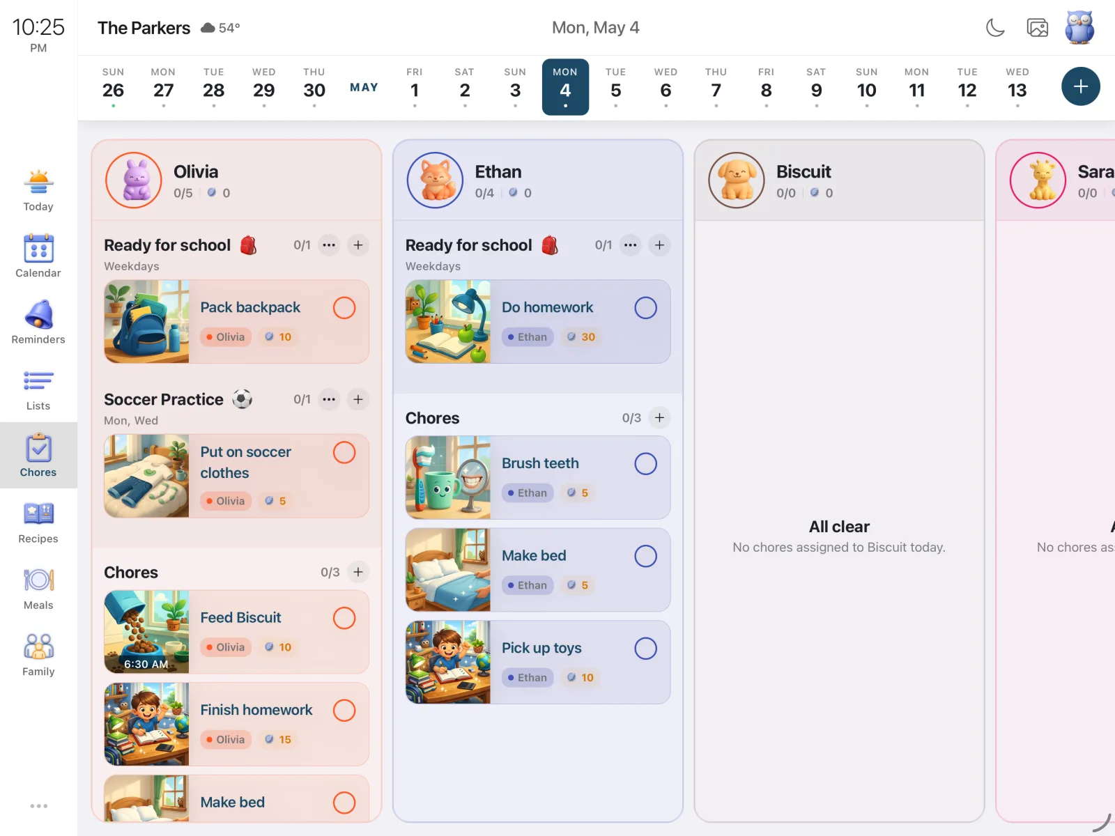
A routine is now a named container - "Morning," "After-School," "Bedtime," whatever your family already calls the moments in its day. The routine owns what its chores would have shared anyway: schedule, assignee, identity (name, emoji, color), progress, and the celebration when it completes.
Add a chore inside a routine, and the form gets shorter. The "who" and "when" sections disappear and a small banner takes their place: Inside the Bedtime routine. The chore inherits its parent's schedule and assignee. Adding a fifth bedtime task is four taps, not a full form. Push bedtime to 8:30, every chore inside follows.
Routines also surface under three colored time-of-day sections - Morning, Afternoon, Evening - plus an Anytime catch-all. Sections collapse automatically once their slot has passed for the day. You don't need a clock; you need to know whether bedtime is done.
Built for the kid who has to do them
The hardest user in a family app isn't the parent - it's the kid who didn't ask for the app and will close it the moment it feels like homework. A few things consistently moved the needle:
- Visual personality. Each routine has a parent-chosen emoji and color. "Bedtime" with a moon and deep purple looks like bedtime before any words are read.
- Smaller chunks. Four chores under a named routine feel manageable. Twelve atomic tasks on a flat list don't, even if it's the same twelve things.
- Visible progress. Every routine card shows "2/5" under its title. Each member's column shows day-wide totals next to a feather icon.
- Real feedback. Tapping a chore plays a small celebration. Finishing the whole routine fires a bigger one.
The currency is feathers - not stars, coins, XP, or unlockable avatars. Other family apps have been mining the same gamified vein for a decade; we wanted something quieter that still feels like a real reward.
One screen, two layouts
On a phone, the screen is personal: one family member at a time, swipe to the next. On a tablet - especially one mounted in the kitchen as a Sense Hub - the layout becomes a horizontal row of member columns, the whole family visible at a glance. Walk past the counter, scan three columns, know whether bedtime is on track without unlocking your phone. Members are ordered kids-first by default, because that's whose progress you check most.
Try the new chores screen
Free to start, runs on phones and tablets, works as an always-on family display in Hub mode.